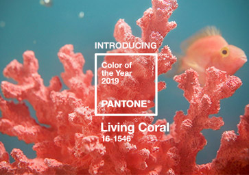
 Pantone, the provider of professional colour standards for the design industry, has announced that Living Coral (PANTONE 16-1546) is the Pantone Colour of the Year 2019.
Pantone describes the shade as ‘an animating and life-affirming coral hue with a golden undertone that energizes and enlivens with a softer edge’.
Explaining the reasoning behind the choice of shade, Pantone said: ‘We get energy from nature. Just as coral reefs are a source of sustenance and shelter to sea life, vibrant yet mellow Living Coral embraces us with warmth and nourishment to provide comfort and buoyancy in our continually shifting environment.
‘In reaction to the onslaught of digital technology and social media increasingly embedding into daily life, we are seeking authentic and immersive experiences that enable connection and intimacy. Sociable and spirited, the engaging nature of Living Coral welcomes and encourages lighthearted activity. Symbolising our innate need for optimism and joyful pursuits, Living Coral embodies our desire for playful expression.’
Leatrice Eiseman, executive director of the Pantone Color Institute, commented: “Colour is an equalizing lens through which we experience our natural and digital realities and this is particularly true for Living Coral. With consumers craving human interaction and social connection, the humanising and heartening qualities displayed by the convivial Pantone Living Coral hit a responsive chord.”
Laurie Pressman, vice president of the Pantone Color Institute, added: “As a shade that affirms life through a dual role of energising and nourishing, Living Coral reinforces how colours can embody our collective experience and reflect what is taking place in our global culture at a moment in time.”
For product design, Living Coral is described as ‘naturally suited for products across all ages and genders. Materials with texture and convivial colours such as Living Coral ‘appeal to our desire for products exhibiting humanising and heartening characteristics,’ Pantone said.
‘When used as a bold statement in settings and décor, Living Coral fosters immersive experiences such as pop-up installations and interactive spaces, tied to a playful spirit. As a colour linked to tactility and human connection, Living Coral in shag rugs, cosy blankets and lush upholsteries create a warm, comforting and nurturing feeling in the home. With its ebullient nature, Living Coral adds a dramatic pop of colour to any room setting whether in decorative accessories, tabletop, or on the wall.’
In celebration of Living Coral as the 20th Pantone Colour of the Year, Pantone has partnered with Tribute Portfolio, Marriott International’s newest collection of independent hotels, to create a first-of-its-kind pop-up pantry that will allow people to experience an immersive tribute to colour at select hotels around the world.
Tribute Portfolio and Pantone will introduce a series of interactive Pantone pantries in ‘indie-spirited and creative communities around the world’, beginning at Art Basel Miami at the Royal Palm South Beach Miami Resort and then travelling to The Alida Hotel in Savannah, Georgia and The Slaak Rotterdam in The Netherlands.
Pantone said its Colour of the Year selection process ‘requires thoughtful consideration and trend analysis’. To arrive at the selection each year, experts at the Pantone Color Institute ‘comb the world looking for new influences’. These can include the entertainment industry and films in production, travelling art collections and new artists, fashion, all areas of design and popular travel destinations, as well as new lifestyles, playstyles, and socio-economic conditions.
Influences may also stem from new technologies, materials, textures, relevant social media platforms and even upcoming sporting events that capture worldwide attention.
For 20 years, Pantone’s Colour of the Year has influenced product development and purchasing decisions in multiple industries, including fashion, home furnishings, and industrial design, as well as product, packaging and graphic design.
Past selections for Colour of the Year include:
- PANTONE 18-3838 Ultra Violet (2018)
- PANTONE 15-0343 Greenery (2017)
- PANTONE 15-3919 Serenity and PANTONE 13-1520 Rose Quartz (2016)
- PANTONE 18-1438 Marsala (2015)
- PANTONE 18-3224 Radiant Orchid (2014)
- PANTONE 17-5641 Emerald (2013)
- PANTONE 17-1463 Tangerine Tango (2012)
- PANTONE 18-2120 Honeysuckle (2011)
- PANTONE 15-5519 Turquoise (2010)
- PANTONE 14-0848 Mimosa (2009)
- PANTONE 18-3943 Blue Iris (2008)
- PANTONE 19-1557 Chili Pepper (2007)
- PANTONE 13-1106 Sand Dollar (2006)
- PANTONE 15-5217 Blue Turquoise (2005)
- PANTONE 17-1456 Tigerlily (2004)
- PANTONE 14-4811 Aqua Sky (2003)
- PANTONE 19-1664 True Red (2002)
- PANTONE 17-2031 Fuchsia Rose (2001)
- PANTONE 15-4020 Cerulean (2000)
The Pantone Color Institute is the business unit within Pantone that highlights top seasonal runway colours, forecasts global colour trends, and advises companies on colour for product and brand visual identity. Through seasonal trend forecasts, colour psychology, and colour consulting, the Institute partners with global brands to leverage colour in their design strategies.