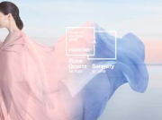
 For the first time, the blending of two shades – Serenity and Rose Quartz -have been chosen as Colour of the Year for 2016 by Pantone, the global authority on colour and provider of professional colour standards for the design industries.
The hues – PANTONE 15-3919 Serenity and PANTONE 13-1520 Rose Quartz – are described as ‘a softer take on colour’. Leatrice Eiseman, executive director of the Pantone Color Institute, said: “With the whole greater than its individual parts, joined together Serenity and Rose Quartz demonstrate an inherent balance between a warmer embracing rose tone and the cooler tranquil blue, reflecting connection and wellness as well as a soothing sense of order and peace.”
For interiors, whether on their own or combined with other shades, the pairing of Serenity and Rose Quartz ‘bring a feeling of calm and relaxation into the home environment,’ Pantone says. It notes that the two colours are a suitable choice for rugs and upholstery, and also work well in paint and for decorative accessories.
Pantone adds that Serenity and Rose Quartz coloured kitchen items and tableware, as well as home accessories like candles, decorative bowls, vases and florals, add ‘subtle colour accents while contributing to a welcoming and peaceful space; translucent, glazing, matte and metallic shine are key finishes’.
For 16 years, Pantone’s Colour of the Year has influenced product development and purchasing decisions in multiple industries, including fashion, home furnishings and industrial design, as well as product packaging and graphic design.
Past selections for Colour of the Year include: PANTONE 18-1438 Marsala (2015), PANTONE 18-3224 Radiant Orchid (2014), PANTONE 17-5641 Emerald (2013), PANTONE 17-1463 Tangerine Tango (2012), PANTONE 18-2120 Honeysuckle (2011) and PANTONE 15-5519 Turquoise (2010).